How to Pick the Perfect Color Scheme for Home Interiors
Tips for Choosing a Color Scheme for Home Interiors
It is no longer fashionable to paint each room in the house a different color, so you should aim to pick a color scheme that will suit your entire home. However, it is important to make the right color choices, as this can help to enhance your home’s future value. It is a good idea to have a starting point before making any firm color decisions, and this can be anything from an old photograph to a favourite item of clothing. You may, on the other hand, prefer to have a specific theme in your home that is based on flowers, trees, beautiful sunsets, dramatic coastlines, or animals – the possibilities are endless! Once you have a good starting point, you should be well on your way to making the right color choices for your home.
We found a great tool on the Benjamin Moore website. It’s easy to use and let’s you select from a variety of room photos. Hopefully you can find one that is similar to yours. Then simply select any colors for the walls and trim so you can easily visualize how the combination will look in a room setting. There is also a version that will let you upload a photo of your room but you have to sign up and login to use it.
Using this tool is much easier than bringing home 20 little paint swatches and trying to visualize your room in that color. I’m sure we have have all been there. The color seems subtle on the little swatch and then you paint a whole wall and step back and say WOH instead WOW.
Try out this tool. It may save you some money and a couple of trips back to the paint store.
Benjamin Moore – Color a Room Tool
Benjamin Moore – Personal Color Viewer (Upload your own photos – Free but requires a sign-up)
Neutral colors
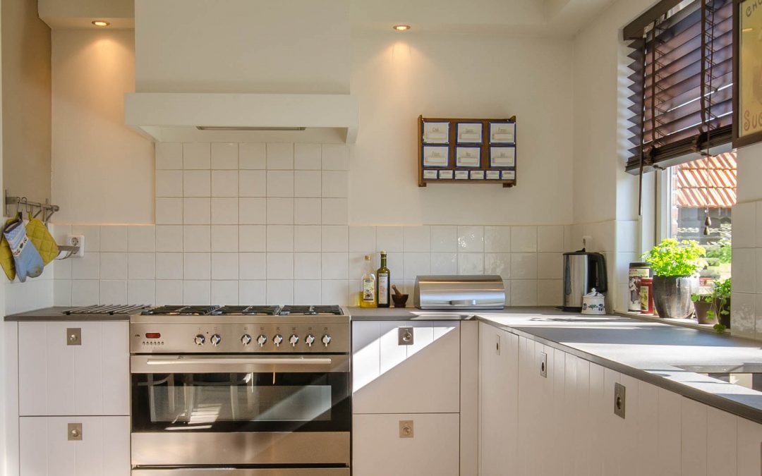
 It is always best to begin with a neutral shade before adding any other colors. Neutral shades are the building blocks of your home and help to lay the perfect foundations for bolder shades. Choose a neutral color that reflects the style of your home and can be used throughout the house. When choosing a color Scheme for home interiors, it is also important to make sure that your chosen colors blend well with the amount of light that comes into each room.
Consider undertones
When choosing colors, it is important to be aware of the fact that all paint colors have undertones. Undertones are virtually impossible to see in the paint tin, but an unwanted tone can completely ruin the appearance of a room – beige paint, for example, can often have visible pink undertones when used on the walls.
Start adding colors
Once you are happy with your chosen neutral color, you can begin adding more colors. If there is a particular color you want that isn’t available, you can always mix your own at the paint shop. However, before ploughing in and using any of your chosen colors on the walls of your home, make sure you prepare a large test area first. You may find it helpful to paint the colors on poster boards and hold them up to get a good idea of the look you want to achieve.
Begin to coordinate
You can begin to coordinate the look of your entire home through repetition. Begin by using one of your chosen paint colors, for instance orange, at least twice in the house. You can do this by painting the walls of one room in orange paint and then using an orange patterned wallpaper in another. Then repeat this process with your other chosen colors to bring everything together.
Think about lighting and sight lines
When choosing a range of accent colors for your home, it is important to consider how the hues will look when they are viewed from other rooms in your house. A combination of natural light and paint undertones can greatly affect the look you want to achieve. If a lot of the rooms in your home lack natural light, then it is best to keep the use of dark accent colors to a minimum.
Bring in soft furnishings
Once your paint colors are in place throughout your home, you can begin to bring in soft furnishings. Choose plain and/or patterned curtains, throws, cushions and rugs to blend in with your chosen color scheme. Wooden floors and rustic furniture can add a real touch of class to any room and can blend well with an array of different colours of wallpaper, paint, and fabrics.
Finishing touches
No room is complete without a few finishing touches. Consider vases filled with real or artificial flowers, plants, pictures, candles, memorabilia, and perhaps even a few souvenirs from your travels. Remember to consider the colour of each item you have and decide which room and position will suit it best.
When your home is finally complete, you will be able to appreciate the importance of picking the perfect colour scheme for home!
Also check out “Get A Wow Factor With These Small Living Room Ideas“


 If you have an airy bright beautiful room with lots of light why not place your desk facing the windows for just the right amount of lighting for your online Zoom conferences. This Scandinavian style desk and chair complimented by a neutral modern sofa and beautiful teal accent walls and carpet make this home office dramatic yet inviting.
 If your thing is eclectic shabby chic why not incorporate this unique desk into your home office. Make this look a reflection of your personality. Feminine yet professional. The addition of the soft pinks really brings this look together
 Many of us our finding in this pandemic that more and more couples are working at home. How do you solve this dilemma in a condo/apartment. This long extended desk built for two can definitely be the remedy to your problem. The light wood desks make the room airy and inviting with plenty of home offie work space. Enjoy your time together!
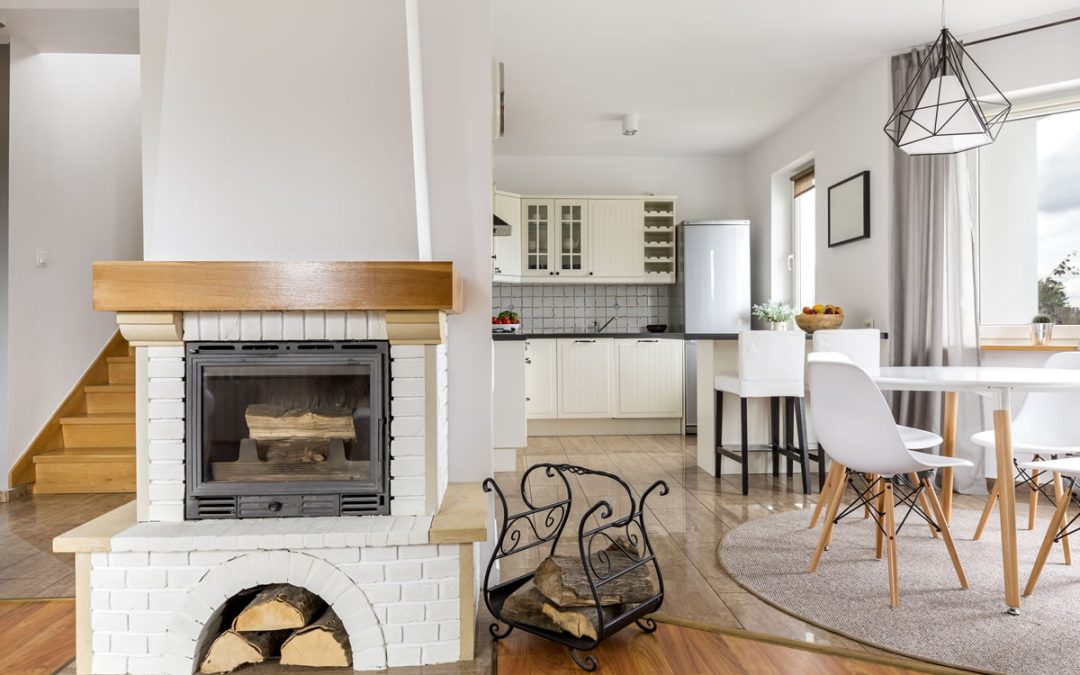

 This is the classic case of taking something old and making it new again. A very simple way to update a brick fireplace is adding a coat of paint, in this case a beautiful white color was chosen to keep in the monochromatic scheme. Placing the dark accessories on top of the mantle along with some greenery ads a modern touch. The black and white patterned hearth added another interesting element to the overall look. The two sconces on either side of the fireplace ads a beautiful dimension and balance.
 Vaulted ceilings can be difficult to work with especially if you have odd shaped walls. This is a perfect example of using an odd space and yet creating balance as well as elegance. The beautiful trim around the bookcase, mantle, and side of wall brings it all together. The herringbone pattern on the fireplace adds a stunning texture to the overall look.

 This gorgeous stone fireplace though maybe oddly placed in this room is tastefully accented with a complimentary sitting chair that gives it a cozy feeling. A charming way to balance a fireplace that may be placed in an odd corner.
 A classic looking fireplace/tv that adds elegance to this room. Tastefully done, simple yet dramatic. The contrasting wall color makes the cream color of the fireplace stand out just enough for just the right amount of dramatic contrast. Simple fireplace accessories bring beauty and elegance to this look.